1.0 Section A
Critic the graph from both its clarity and aesthetics. At least three from each evaluation criterion.
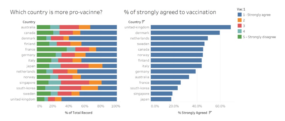
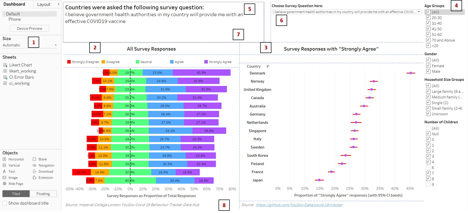
These are the original data visualizations created by the research team conducting a study to understand the willingness of the public on Covid-19 vaccination.
- Clarity:
1st chart shows a cumulative horizontal stacked bar chart. It is hard for users to perform comparisons across the countries due to the differing positions.
There are no value labels on the 1st chart, further making it hard for users to have a better idea of category responses across countries which may have bars with similar sizes
The data source utilized for this visualization was not made known. This makes is tough for users to do further exploration or fact-checking if needed.
The 1st chart seems to be sorted in alphabetical order, however the 2nd chart on the right is sorted by descending proportion of responses with “Strongly Agree”. This makes it possible confusing for users, especially when the 2nd chart was probably meant to provide a more specific view of the pro-vaccine sentiments of the various countries.
Knowing the data source, there are actually multiple questions that were asked, and Vac 1 only provides a single narrow perspective as to various countries’ behaviour towards Covid-19 vaccines. This makes it hard for users to get a meaningful and balanced viewpoint.
There is a lack of breakdown of various population demographic fields such as gender, age, etc. Such fields could have provide meaningful and different narratives that are possibly actionable by governments or organizations.
- Aesthetics:
Country names are in lower case and non-standardized. While not wrong, it is aesthetically not pleasing.
The actual contents of the survey question is not shown, instead it is left as “Vac 1”. It is hard for users to interpret the results in a meaningful way without understanding the background context.
The colors are seemingly random, as strong colors like red (which typically signify negativity) are used for a Neutral response, as opposed to Strongly Disagree responses.
2.0 Section B
- Advantages:
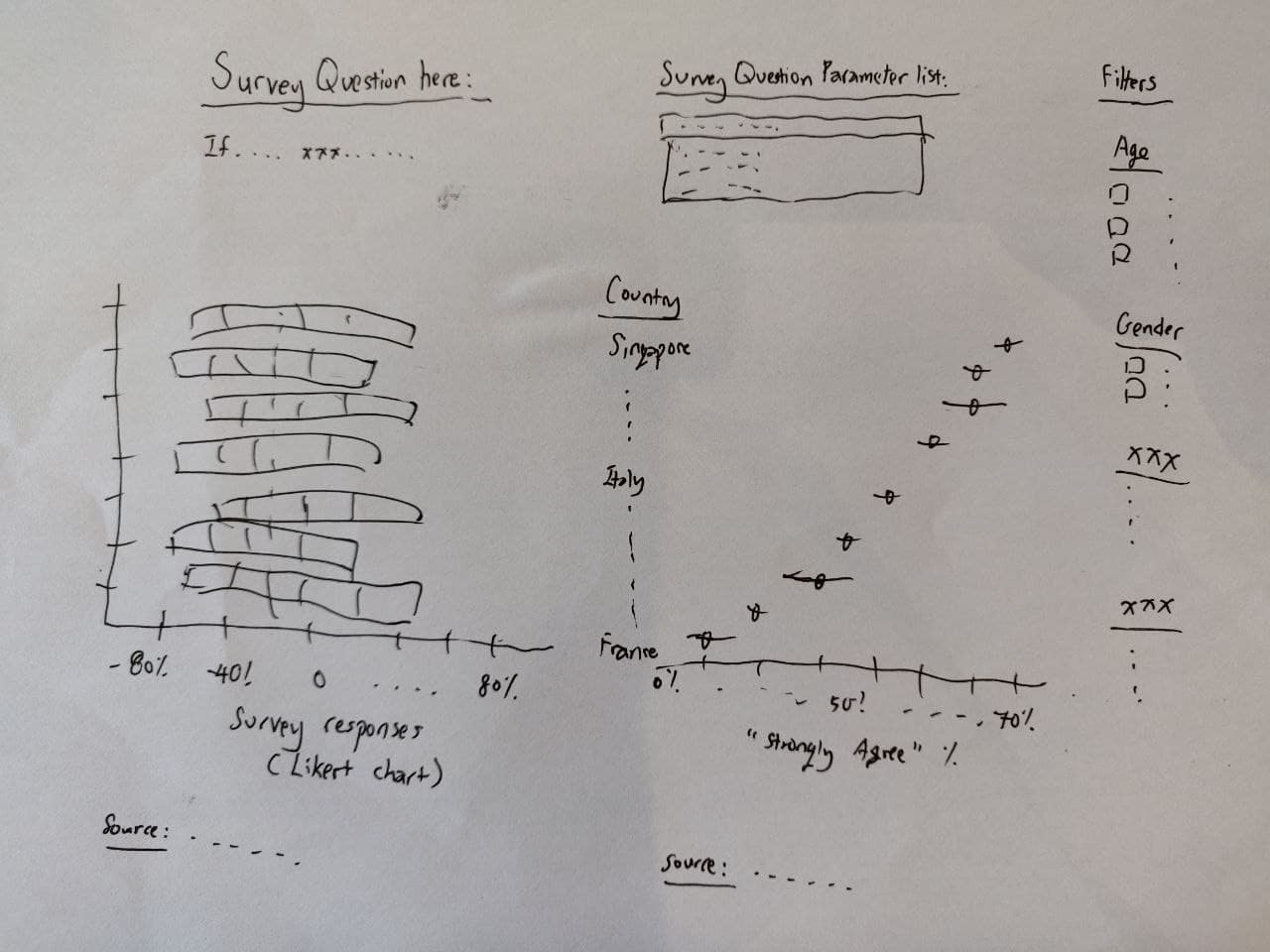
A likert chart is created to provide a comparison where Negative sentiments are clearly on the left, and Positive sentiments are clearly on the right.
There is a reference line in the middle of the Neutral category, to make it easier for users to anchor to, and make sense of the values.
There are value labels on the 1st chart to further help users make sense of, and compare values between countries where the size of the bars could be quite similar.
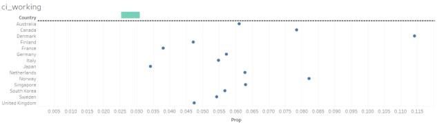
The 2nd chart provides a 95% confidence interval band to help users have a better idea of how reliable the estimates of the responses are, as values are quoted in % format. (Some countries may have had lesser responses, yet have an overall higher proportion of Strongly Agree. It may be debatable as to how accurately it represents that particular demographic segment.)
Both charts have been sorted in descending order of Proportion of Strongly Agree sentiments for each Survey question. This standardization allows for better ease of comparison.
A parameter with a drop-down list is provided for users to be able to see responses and trends for different questions. This provides users with more context, whether it be confidence in the vaccine, or fear of the disease, etc. This can provide a more well-rounded or balanced viewpoint.
Demographic fields have been neatly grouped/ binned and are available for further filtering and analysis if required. This may reveal more interesting perspectives apart from a quick, high-level/ superficial interpretation based on the original charts.
3.0 Section C
Using Tableau, design the proposed data visualization.
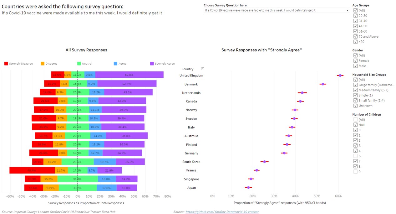
The final dashboard can be accessed here: https://public.tableau.com/profile/ng.wee.kien#!/vizhome/DVM2_submission_v2/DVM2Dashboard?publish=yes
4.0 Section D
Provide step-by-step description on how the data visualization was prepared.
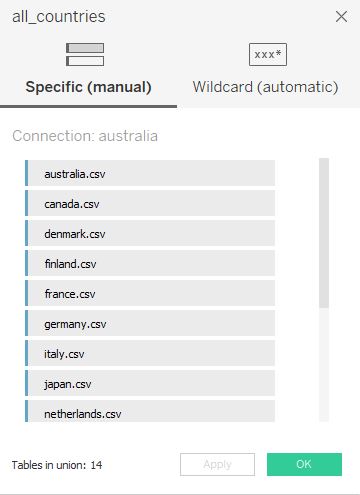
*Part 1: Bringing the data in + After downloading the data files, unzip the folders and ensure they are all in the same location. Drag the 1st file (“australia.csv”) into Tableau. Select the New Union function to import the chosen countries data using a manual connection. Note: Upon inspecting the raw data in excel, for ‘Sweden.csv’, column header ‘record’ had to be changed to ‘RecordNo’ to be consistent with the other data files.
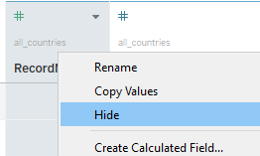
- Select all the columns that we do not want to use, right-click, and select Hide
*Part 2: Creating a Likert Chart (Tableau)
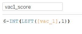
- Create calculated fields for the various survey question responses. The original data has 1 as Strongly Agree, 3 as Neutral, and 5 as Strongly Disagree. For ease of understanding to the general user, we will remap the scores in reverse order. The remapped score will have 1 as Strongly Disagree, 3 as Neutral, and 5 as Strongly Agree.
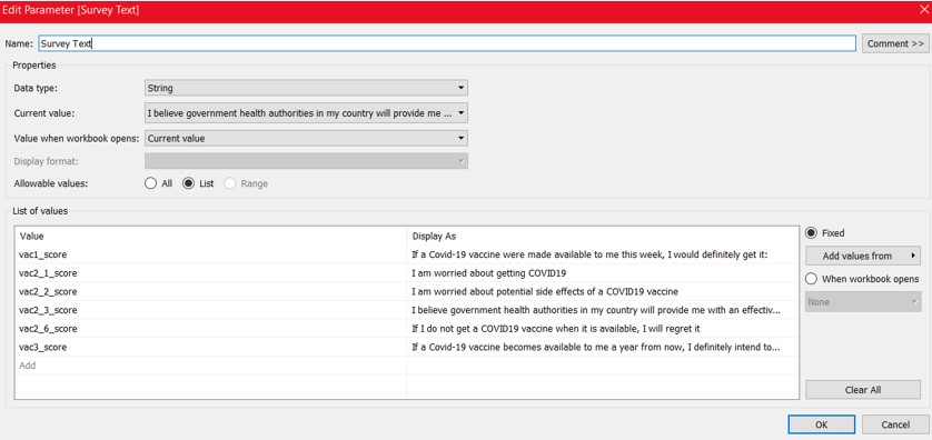
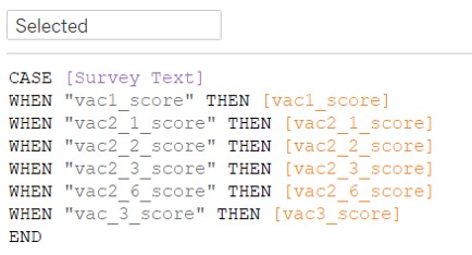
- Create a Parameter: Survey Text. This is a String data type parameter. This is for users to choose which survey question to visualize and analyze. We will map the relevant display values as the respective survey text questions.
- Create a calculated field: Selected. This picks out what value the users chose in the Survey Text parameter, and the respective visualizations model those responses.
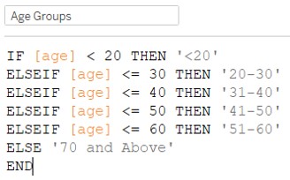
- Create a calculated field for Age Group
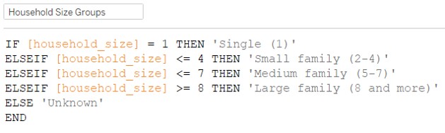
- Create a calculated field for Household Size Groups
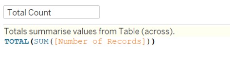
Create calculated field: Number of records. This is just a constant value of 1.
Create calculated field: Total Count
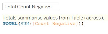
- Create calculated field: Count Negative
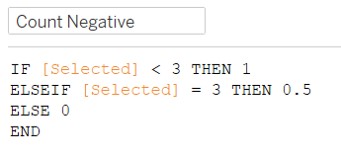
- Create calculated field: Total Count Negative
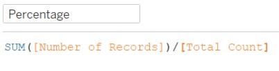
- Create calculated field: Percentage
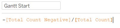
- Create calculated field: Gantt Start
- Create calculated field: Gantt Percent
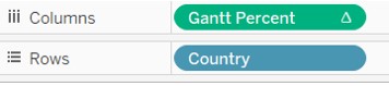
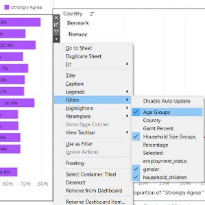
- Bring Country to Rows, and Gantt Percent to Columns
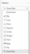
- Change Marks from Automatic to Gantt Bar
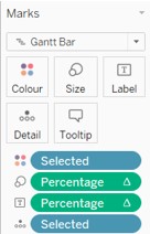
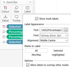
- Bring Selected to Colour and Detail, Percentage to Size and Label
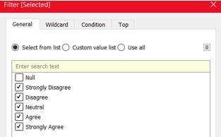
- Bring Selected to Filters, and deselect Null values
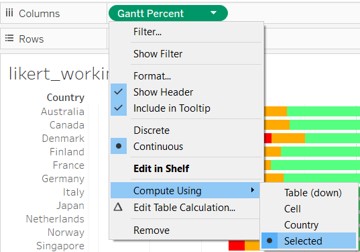
- Ensure that Percentage (Size and Label), and Gantt Percent are toggled to compute using Selected.
Change view from Standard to Entire View
Edit title of Legend (“Selected”) to “Responses”
Right click on Survey Text Parameter and select Show Parameter
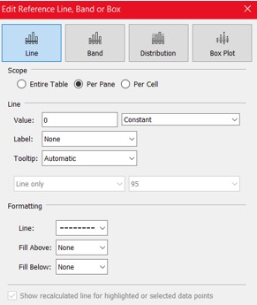
Add Reference Line to X axis of Likert chart by right clicking on the X axis. Change the settings to picture shown below.
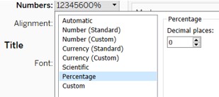
- Change format of X axis to percentage with 0 decimal points
Change format of Percentage field to 1 decimal point
Change title of X axis to “Survey Responses as Proportion of Total Responses”
Change Label settings to align to middle and make font size smaller
*Part 3: Creating Confidence Interval Error Bar charts
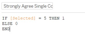
- Create a calculated field for Strongly Agree Single Count. We are creating counts for responses with “Strongly Agree”.
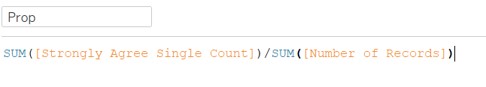
- Create a calculated field for Prop. We want to find out the proportion of responses which gave “Strongly Agree”.
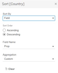
- Go back to the Likert chart, and sort Country (rows) by Prop under Field. This allows us to sort in descending order for countries with highest to lowest proportions of responses with “Strongly Agree”.
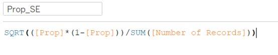
- Create calculated field for Prop SE
Create calculated field for Z_95%. It has a constant value of “1.959964”.
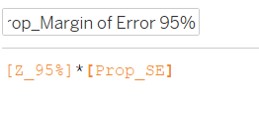
Create calculated field for Prop_Margin of Error 95%
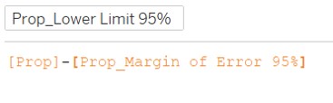
- Create calculated field for Prop_Lower Limit 95%
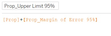
- Create calculated field for Prop_Upper Limit 95%
Move Country to Rows, Prop to Columns
Change Mark for Props from Automatic (line) to Circle
Move Measure Values to upper secondary horizontal axis
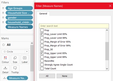
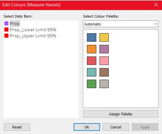
- Edit the filter for Measure Names, and keep only 2 measures: Prop_Lower Limit 95% and Prop_Upper Limit 95%.
Move Selected to Filters, and uncheck ‘Null’ values.
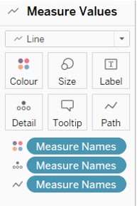
Change Measure Values from Circle to Line. Press Ctrl+Click and drag measure values to Path and repeat the same to Colour.
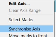
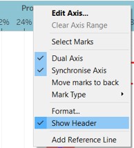
- Right click on the X axis with a smaller range of values, and select Synchronize axis
Under AGG(Prop) mark, change Measure Names from Detail to Colour.
Change colors of Measure Names (on right side) as required
Under columns, change the order of Measure Values and AGG(Prop). This allows AGG(Prop) Circle to appear ‘in front of’ Measure Values Line.
Change the format of both X-axis to percentage, with 0 decimal points.
Change the view from Standard to Entire View
Under Rows, Country, Sort by Field > Prop in descending manner. (similar to the Likert Chart)
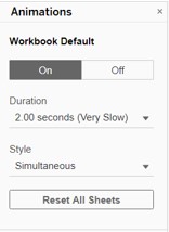
Turn on Animations, and change settings as desired.
- Right click on the upper horizontal axis, and uncheck Show Header.
Edit the lower horizontal axis title to “Proportion of”Strongly Agree" responses (with 95% CI bands)"
Right click on Country on the vertical axis, and change the font color to black, font size to 9, and Alignment to Centre.
Right click on Parameter Survey Text, and select Show Parameter.
*Part 4: Creating the dashboard
- Toggle the size of the dashboard to Automatic
- Drag in the Likert Chart, change the legend to floating, and resize accordingly as a single row above the chart.
- Drag in the Confidence Interval Error Bar Chart
- Add the relevant filters for demographics into the dashboard
- Add a text box on the top left, adjust the contents as shown.
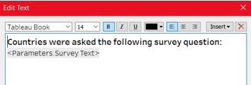
- Expose the Survey Text parameter and place it on the top right of the dashboard.
- Add Blank objects around the dashboard to resize the layout accordingly.
- Add text boxes at the bottom to cite the data source and link.
*Part 6: Going live + Publish the final dashboard to Tableau Public Server.
5.0 Section E
Describe three major observations revealed by the data visualization prepared.
1st insight:
For the question: I am worried about getting Covid-19, Japan holds the top spot for highest proportion of “Strongly Agree” responses. Meanwhile, an European country like France is somewhere in the middle of the table. South Korea comes in at the 2nd spot. This observation holds true regardless of Gender. One might infer that certain Asian countries might be more concerned about contracting the Virus than certain European countries.
2nd insight:
For the question: I am worried about potential side effects of a COVID19 vaccine, France had the highest proportion of “Strongly Agree” responses at 44%, with Japan coming in next at 35%. However, when selecting only the Female gender, France was at 53% with Japan coming in at 40%. We can see that the gap was widened. In addition, the gap was narrowed when looking at only Males, with France at 33% and Japan at 30%. Another thing to note is that there was greater variance in the proportion for Males. Put all together, one might infer that people in France and Japan both have the highest proportions of people who feel strongly about the potential side effects of the vaccine. In addition, females in both an European country like France and a ‘traditional’ and ‘conservative’ Asian country like Japan feel more strongly about it than their Male counterparts. This could point to Females being more risk averse than Males for the risk of potential side effects from a Covid-19 vaccine.
Put together with the 1st insight, it seems that a country like France is not too concerned with contracting the virus, and also is wary of potential side effects of the Vaccine. This might give some indication to their willingness to be vaccinated (not very willing). This is juxtaposed with Japan, where they rank highly on being worried about Covid-19, AND they also rank highly on worrying about potential side effects of a vaccine (albeit more towards the female gender). It remains to be seen if responders in Japan would be willing to take the vaccine in the near-term.
3rd insight:
For the question: If a Covid-19 vaccine were made available to me this week, I would definitely get it, Japan ranked last at 18% and France was 3rd last at 22%. This indicates that in the short term, both countries are less willing to take a vaccine.
For the question: If a Covid-19 vaccine becomes available to me a year from now, I definitely intend to get it, Japan still ranked last at 25%, and France was 5th last at 35%. This indicates that although in general both the proportion in both countries have become more willing to take a future vaccine, compared to other countries, they are still relatively unwilling to do so.
Lastly, for the question: I believe government health authorities in my country will provide me with an effective COVID19 vaccine, Japan is again, still ranked last at 15%, and France is 2nd last at 19%. Both countries have low confidence in their government’s ability to provide them with an effective Covid-19 vaccine.
Putting all the insights and observations together, it seems that even for countries like Japan where they are very worried about Covid-19, they might be unwilling to take a vaccine, even if it were available (both in the short term, and even in the long term where more results and proof may be available). One may also infer that this may be due to the low confidence in the respective governments ability to provide them with an effective (and possibly safe) vaccine. To a certain extent, France shows a similar trend.
It may make some sense for governments worldwide to consider re-assuring their citizens on their capabilities to procure a SAFE and effective vaccine, if a higher vaccine adoption rate is a key objective. Similarly, companies may also consider such trends in their product manufacturing strategies in the coming months/ years.